Automatic language translation
Our website uses an automatic service to translate our content into different languages. These translations should be used as a guide only. See our Accessibility page for further information.
Learn what the key factors are when you are creating charts and graphs.
Provide a meaningful heading for your chart or graph.
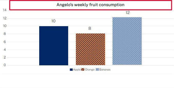
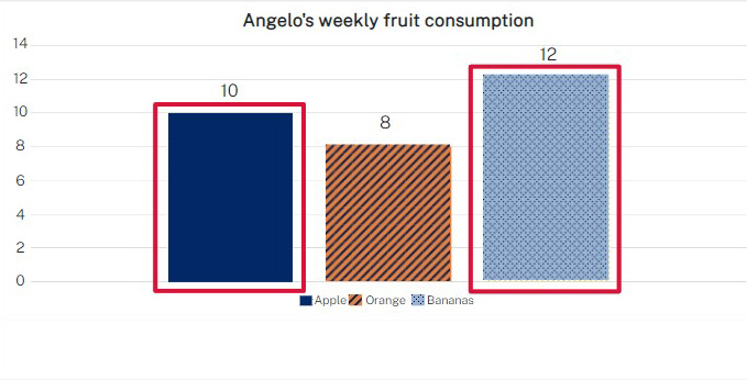
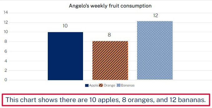
The chart uses strong contrasting colours for the data sets so it is easy to differentiate between them. Also consider using patterns as well as colour to further differentiate between multiple data sets and reflect this in the legend. For line graphs use different line styles such as dashes and dotted lines.
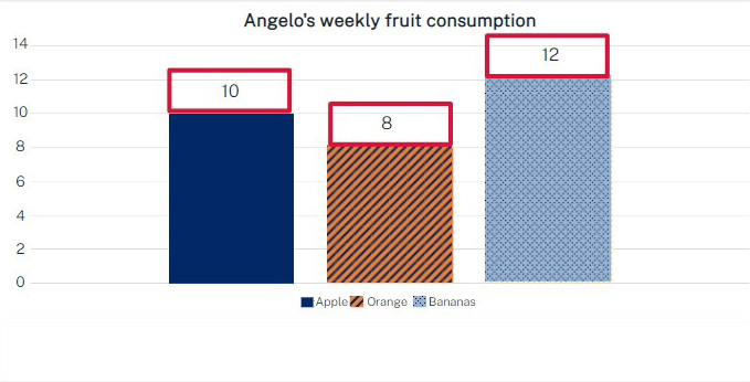
The chart has a label for each element. In this case, the labels are the numerical values for each fruit, provided here above each column.
All charts and graphs, including organisation charts or flow charts, should have short alt text describing the chart or graph, with a reference to the full text alternative version and where to find it.
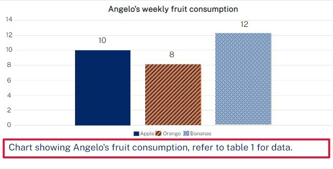
Remember to include a plain text version such as a data table so that anyone who has difficulty using the chart can still access the full information.
| Fruit | Amount |
|---|---|
| Apples | 10 |
| Oranges | 8 |
| Bananas | 12 |
Captions give people a summary of the information contained in a chart or table.
11 Oct 2022